Design Tips

Adobe® End Support of Postscript Type 1 fonts

Adobe® Ends Support of True Type fonts

Nothing is fixed and everything changes. 

With the creation of web fonts, responsive design, and apps in the Cloud, the way fonts are built has changed too. Our team started noticing the adverse effects of these updates when our trusted creative design apps started crashing frequently. We discovered it was often when using older fonts or some designed by certain foundries.  Plus some super fun free ones that maybe weren’t coded well, to begin with, may have played a role. We have come to accept that Adobe Creative Cloud applications (you know the ones all graphic designers live and breathe by) only play well with Adobe cloud fonts. In addition to this realization, Adobe has also announced that they will be ending support of Postscript Type 1 fonts in 2023. 

This all matters to brand owners because the Helvetica typeface your designer used in your business card design from 2017 may not render correctly in your next update. If your brand visuals and logo were designed with Postscript Type 1 fonts or are not developed by Adobe your designer may need to make adjustments.

Options available to ensure your brand fonts are up to date:

  • Change your font entirely if there is not a compatible version of the brand font (stab to the heart)
  • Show certificate of license – depending on how many years ago it was purchased this may be impossible  (the license is probably on some installation CD that was obsolete 5 years ago)
  • Purchase a new font license to continue use, update the font files and ensure they are not type Postscript Type 1 (cha-ching!)
  • Font license pricing is across the board. First, you have to know if your brand materials just incorporate Helvetica Bold or a combination of Helvetica Medium and Helvetica Light Condensed? One font style, like Helvetica Light, can be $9.99 to $99.99. If you need to purchase the whole Helvetica family of fonts (30+ styles) this can begin to break brand marketing budgets.

How can Adobe® dictate how fonts are supported and End Support of Postscript Type 1 fonts?

Connection Group has been using Adobe® Creative Suite since its invention. We started with installation CDs for each software product from Photoshop to InDesign and even Flash. Changing now would be reinventing the wheel – plus there aren’t other compatible options at this time. It’s also not just Adobe® making changes, it’s a digital revolution – nothing is fixed and everything changes.

Personally, I love that we don’t have to frantically locate a license key when a computer station needs a fresh install of Adobe® Creative Cloud.  Adobe® Cloud allows us to install fonts under the Creative Cloud platform at a whim – a font hoarder’s dream. As long as we maintain our Adobe Cloud membership we have the license to use the fonts. However, for fonts to function in all media and for font foundries to protect their licenses, changes had to be made. The font license (like the Adobe cloud license) covers a specific number of users or computers.

When we design brochures, sales sheets, print magazines, etc., the logo graphics and the brand fonts can be sent to the commercial printer or pre-press company. This is still a legal option. Sending fonts to others, such as a virtual assistant, or even your IT personnel may not be covered under the brand design firm’s license.

For new brands and others who have updated their brand visuals recently your need for Postscript Type 1 font support is not likely. Most software applications stopped supporting Postscript Type 1 font in early 2005. Adobe® is one of the last applications to phase them out. If you use Postscript Type 1 fonts in Adobe products and need help preparing for the final demise visit this article in Apple Insider for more information.

Font Copyright Infringement – Protect Yourself and Your Brand

Font copyright infringement

What? What is that all about? Anyone who has designed social media graphics, posted photos to blogs and websites, etc. has encountered information about art and photo copyrights. But font copyright infringement may be new to many of you.

When you hired a graphic design and marketing firm to develop your brand and design your logo you also may have received a brand standards guide. In that brand standards guide, the graphic designer provided names of the fonts utilized for your visual brand. Intentional use of fonts and colors is key to establishing visual consistency in all communications and media promotions.

If you are designing images connected to your brand you will want to purchase licenses for the fonts. Fonts are designed by independent graphic designers and type foundries. Therefore, fonts hold copyrights and require licensing. Much like we do not own our domain names for our corporate websites, we do not ‘own’ fonts. These days with the cloud and digital marketing, discovering font copyright infringement is much easier than it has ever been.

Use of Fonts on Products and Apparel

This is also very important if you are selling products that use fonts. Whether you are designing and selling decorative signs, t-shirts with professional lettering, and any digital artwork for download and reproduction be sure to check the copyright of the fonts you use. Some sublimation printers come with software and fonts that may allow unlimited use, fonts you find online may not. Be sure to check the usage license on all fonts you use. If you are designing products or digital graphics for the mass market, learning to design your own original fonts may be fun. Another option is looking for font designers on Etsy and other marketplaces. Original font designs by freelance artists may be less costly and have more flexible licensing than the large foundries.

Keep in mind, even if you design a clever typographical design, font copyright is different from fine art or graphic design copyright. Just varying the fonts size, color or using a combination of bold, italic, small caps, etc. in a typography design is not enough to claim originality. Protect yourself, read all font licenses very carefully.

Font Copyright Infringement is a Honey Hole for Foundries

Font copyright infringement by individuals and corporations is often done by mistake because of an under licensed or unlicensed font. An innocent mistake doesn’t mean they get off with a warning though. Some foundries look for infringement and get as much revenue from enforcement as from normal licensing! There are now automated bots that can scan for font usage in web pages and posted PDFs. The public seldom learns of lawsuits for font copyright infringement because most are settled out of court.

Although there are some tricks like converting fonts to outlines or only using open-source fonts, etc. it is best to play it safe.  So when you need us to create a new team member business card and your brand font is not up to date or licensed please don’t blame your brand design team for adding a font license fee. It’s not revenue for us. It’s protection for your company and brand and it’s an homage to those clever coders and typeface designers who need to feed their families too.

For more information, we referenced this article on Communication Arts for this blog post. 

What Skills Makes Great Graphic Designers Stand out?

Great Graphic Designers Grow with Targeted Training

Great graphic designers are trained in Lansing, Michigan! Each year I spend time with local graphic design experts as well as Lansing Community College’s, (LCC), Communication, Media, and Arts Department faculty members. The LCC Annual Advisory Board Meeting is a time where faculty and selected professionals from the Lansing, Michigan graphic design community discuss what is most important for students to learn to succeed in the graphic design industry. It is interesting to hear other professionals and instructors share what talents they are seeing from students and what skills are sorely lacking as they enter the workforce.

Because LCC is a community college, many students are enrolled for an Associates’ degree. This means they receive a mere two years of training. Other students are there to earn credit to transfer to a four-year college. When students are able to attend a four-year university the additional two years at University offers educators the ability to dive deeper into philosophy.

Graphic Design Theory Including:

  • Design concepts
  • Color theory
  • Drawing techniques
  • Nuances in typography
  • Problem-solving
  • Graphic design software training

However, the majority of LCC students plan to earn their Associates’s degree in Graphic Design, Website Design, or Animation, and enter the workforce right after graduation. The challenge for the faculty and Advisory Committee each year is to determine the most important graphic design training for students during their limited enrollment. These students need to have skills and knowledge that employers find valuable. They need to hit the ground running to be able to compete in a competitive field.

In an ideal world, training would cover all areas. This luxury is saved for the colleges and universities where students will receive Bachelor’s in Graphic Design degrees or hang out until they earn a Masters in Graphic Design.
It is a dilemma that we face each year. In the era of COVID, decreased enrollment, reduced budgets, and inflated graphic design software costs, the questions are even more important. What I appreciate most about our annual meeting is that we are determined to address the needs of the students.

Some of the questions we ask include:

  • What can we do to build better graphic design modules for students?
  • What does a graphic designer need to know to hit the ground running when they graduate?
  • Should there be a strong focus on teaching drawing techniques?
  • Are problem-solving techniques most valuable?
  • What about software, is Adobe Creative Suite® the only game in town?
  • How much time should be allotted for learning specific software?
  • What if graphic design firms switch to a different software?
  • What is a process that separates the creative graphic designer from the novice?

So many clearly important questions and all are difficult to answer. Each of our views is distinctive to our chosen areas of expertise. As designers and art appreciators, we consider what we like and what we look for as employers and instructors. My favorite discussion from this year’s meeting was the list compiled of creative prompts and practices all great graphic designers would benefit from establishing. I would love to adopt many of these into my own daily practice as well as my team of the graphic designer team at Connection Group.

Every Graphic Design Student will:

  1. Complete 7 sketchbook pages each week
  2. Design and develop at least one web component with each brand project
  3. Show process – steps taken to get to the finished design
  4. Demonstrate a clear understanding of fonts and how it relates to other visuals
  5. Create a clean design of a boring project, such as a form (shows tenacity!)
  6. Share designs in public – on Pinterest, Facebook, or other platforms and forums
  7. Develop an online portfolio and a solid, neat interview portfolio
  8. Research great design in print and digital format
  9. Subscribe to Communication Arts and other print or digital design magazines)
  10. Students and designers will enjoy doing some of the tasks above and some may find them tedious.

The interesting part is that all of these tasks are important if a graphic designer is going to be well-rounded and successful.

I believe the skill of graphic design can be taught. However, graphic design that stands out, conveys and emotes a moving and clear message is created by those who are skilled in the ability to see things others don’t see. Great graphic designers can break down complex ideas into simple visuals and messages the mass market understands. Neither a two-year or four-year degree ensures this ability.

Whether it is determined that a sketchbook is required in all graphic design classes, or that software training should be the focus, regular review is ket. I am happy LCC critiques their program and is always striving to bring the highest value to their students and to the organizations that hire them. I am proud to be a member of the LCC Graphic Design Department Advisory Board. I know the entire committee is committed to the success of the students and the value they will bring to the industry we love.

So what did I miss? What daily practices do you think great graphic designers can implement to stay inspired?

Format and Design of a Webinar or Digital Meeting

Most of us never thought we would be responsible for the format and design of a webinar. Nor did we expect we would be spending entire mornings in digital meetings with colleagues we use to share a cubicle with.

Historically, webinars have been embraced as lead generation tools. As a result of the pandemic, webinars and Zoom meetings have become the solutions for all forms of business communication. Today many customers have gone beyond merely attending Zoom and GoToMeeting events to now creating their own webinars. To help in this effort we have put together an outline of things to consider as you create webinars and online meetings.

We will touch on:

  1. Determining the objective for the webinar
  2. Create a webinar format and plan
  3. Establish deadlines
  4. Developing webinar content
  5. Pre-Webinar marketing and advertising to gain attendees
  6. Post-webinar follow up
  7. What to do on the day of the webinar
  8. Creating a webinar registration page on your website or email
  9. Following an outline for webinar creation.

Your first step is setting clear webinar objectives. How will you know if the webinar was successful if you have not defined the objectives beforehand?

#1. Determining the objective for the webinar

  • Are you introducing a new product?
  • Do you want attendees to purchase a product or service at the end?
  • Are you seeking input on new features or training attendees on the use of a product?
  • Do you hope attendees will view you as an expert in your industry by attending your webinar?

Determining the objective for the webinar will help define what content to include, what format the content should take, how you market to prospective attendees, and the results you hope to receive.

#2. Format and Design of a Webinar with a plan and deadlines

Determining the format and design of a webinar comes next. Will the webinar consist of one person going through Powerpoint or pdf slides? Will you have a panel of experts in various departments or companies sharing insights or extolling the benefits of working with you? Will people need to access it live for the best results? Will recordings be available?

Once the format and design of a webinar is determined it’s time to recruit speakers. If you are the presenter or will serve as the facilitator, you can begin to organize content or questions for panelists.

#3. Establish Deadlines for each Phase of Webinar Development

Once guest speakers are secured determine a date and time for optimal attendance. Make sure you avoid holidays, popular industry events, etc. Then work backward from the presentation date to set deadlines for marketing your webinar and completing content.

Consider the following when establishing deadlines:

  • Consider time zones for your prospects
  • If you are delivering a series of webinars can you set them to be consistent with the time of day and day of the week?
  • If guests will have slides, set a date to receive them in advance to avoid any concerns on the day of the webinar
  • Choose dates when announcements will be ready to send out for registration
  • When will registration and website support pages be ready to launch?
  • Determine the last date to enroll

#4. Finally, we get into the Webinar Content

Whether you’re developing webinar content for a software product, professional service, publishing, manufacturing or packaged goods your actual content will vary. Do some research on the content that is getting the best results in your industry.

  • Can you offer a full demonstration of your product?
  • Are there popular highlights of your product or services that all attendees will benefit from learning?
  • Will you let your attendees guide which aspects you will cover through their questions?
  • Should your content be adjusted depending on the audience/demographic, etc?
  •  Do you have a clear niche or unique offering to share that will set you apart from the completion?
  • Will you be explaining your pricing model?
  •  How do you want attendees to interact with you? Can you create leading questions to increase involvement through chat?

5. Creating a webinar registration page on your website

Before you begin marketing your webinar create the supporting pages and links. Create a landing page on your website that all webinar promotions will lead the prospects to. Consider the format and design of the webinar when you create the supporting promotions.  You also do not want to put a webinar/meeting login information on this page. That will be shared in a follow-up email once the attendee registers.

This page should include:

  •  title of the webinar,
  •  brief description of the webinar content
  •  benefits of attending (special offers/discounts to attendees?)
  •  date and time
  •  speaker information
  • simple registration form (Least requirement is name and email. You may want to include company name, role in the company, and other fields depending on your objective.)

Be sure to copy this page URL to include in pre-webinar marketing and advertising.

6. Pre-Webinar marketing and advertising campaigns to attract attendees

To increase webinar registrations you can use a drip campaign to lead visitors to your website through a funnel.

  • Email announcement to current contacts about the upcoming webinar
  • Social media posts with messaging about the webinar and a link to the registration page
  •  Website messaging including banners, pop-ups, buttons, graphics and website sections that link to the registration

Be consistent with your messaging and be clear on what attendees will receive when they register. Consider offering a value-added incentive to attend or to register by a specific date. A discount on a purchase or the opportunity to have questions answered personally, a giveaway to the first 20 enrolled, etc.

If you are just beginning to build your contact list or if you are seeking a large number of attendees right away, consider paying to advertise your webinar. If you choose to purchase pay per click (PPC) advertising on social media, search engines, or targeted websites double-check that links are included for registration. If you are implementing traditional media including tv, print publication, direct mail, etc. double-check that the steps to register are accurate and functioning prior to running any ads. Always ensure your messaging is consistent.

7. What to do the day of your webinar

You can choose to send login information when people first register or you can hold off until a few days before the webinar. It is also advised to send a reminder email on the day of the webinar. Include a contact phone number and or email for troubleshooting issues.

  • Check your system to make sure everything is functioning as expected.
  • Check-in with speakers, you have lined up to remind them of timing and log in contact.
  • Do a test-run with all presenters. Have them share their screen and their presentation.
  • You may also want to share an agenda with everyone in advance so that they know what to expect.

We recommend to skip updates of webinar or meeting software within 24 hours of your scheduled webinars. Functions and features can change and software incompatibilities can arise. Rather than becoming flustered and appearing unprofessional hold off on any updates if you can.

8. Post-webinar follow up

One of the greatest benefits of webinars is the ability to capture the contact information of each attendee. Be sure to request attendees to opt-into future correspondence. This will allow you to reach out to them in response to this webinar and long into the future for other opportunities.

Determine what information or call to action you would like from attendees when you set up your follow up plan.

  • Do you want to survey attendees about specific elements of the webinar?
  • Will you have a drip campaign created that is in line with the webinar topic to continue to keep attendees engaged and interested?
  • Will you offer a limited-time or exclusive discount for purchase or enrollment for attendees?
  • Can you provide a value-added download or membership that is aligned with the webinar topic?

If the survey is most important send that follow up first. Then remember to pace your correspondence. If attendees become overwhelmed with communications from you they may choose to opt-out and you will lose the lead entirely.

We hope this content is helpful to you. Please let us know if we can help you create registration landing pages or format and design of a webinar presentation and slides.  Webinars and online meetings have been forced upon all us in response to the pandemic stay-at-home-orders. Although it may not be the preferred format there is value in adopting digital communication. Companies and organizations, large and small, are seeing cost savings with reduced meeting travel and in-person training begin with addressing the format and design of a webinar. Getting comfortable with the ‘new normal’ of digital meetings will help you stay connected now and in the future.
8 Strategies for Getting More Likes on Facebook

  • Set goals – this give you something to measure progress with
  • Complete your Page – fill in every part of the “About Us ‘ section
  • Increase the visibility of your Page – include a Facebook page link on all your promos and in your email signature
  • Be creative – Add content viewers will enjoy and share. Nobody wants to feel like they are being sold to all the time.
  • Be Engaged – Respond to page posts quickly
  • Develop campaigns – Organize shareable content, create contests. Generate more interaction by added a user generated content (UGC) approach to a campaign.
  • Use Facebook Ads: You can choose ads that will gain page likes. Try this if increases likes are your main interest.
  • Review analytics: Find out who is visiting, and when they are visiting to know what and when to post.

10 Tips for Professional Business Card Design

A business card should clearly communicate who you are and what you do.

  1. Be Clear – Choose a font that is clearly legible.
  2. Keep It Clean – A business card should not replace your brochure or website.
  3. Stand Out  – Nothing helps build a brand quicker than a custom logo design.
  4. Cover It – It’s important to include all points of contact.
  5. Hold On – Compare the weight of the paper from business cards you have received. Choose card stock, preferably 100+ cover .
  6. Finish Strong – A gloss or UV-coated stock is more durable than an uncoated sheet
  7. Add Value – Include a coupon, a calendar, or dates to remember, to encourage the recipient to hold on to your card.
  8. Look Closely – Whether you do it yourself or outsource design, make sure someone who hasn’t been a part of the design process proofs it before printing.
  9. Show Off – Photos are a custom touch to business cards. Realtors, consultants coaches and speakers benefit greatly by including personal images.
  10. Convey Class  – A business card from your desktop printer screams low standards. Full color business cards printed on quality stock are very economical and present your business professionally.

Print File Preparation

Some things to look for:

  1. Proofread it
  2. Have someone else proofread it
  3. Check with your printer about pricing options
  4. Make sure document is created in the correct size (consider proportions)
  5. Quote any original text (cite author)
  6. Use only photos and graphics you have permission to use
  7. Photos and images must be in cmyk format or a specified Pantone® ink or black (no RGB)
  8. Images must be 300dpi resolution at 100%
  9. Print your file on a desktop printer check color, layout, flow of information
  10. Check the fold. Are the copy and images formatted in the panels as intended?
  11. Save the file as a high-resolution print quality pdf (Adobe Acrobat file)
  12. Send to print vendor

Beware Fake Bill and Invoice Scams

Businesses and individuals with websites should keep an eye out for scams that they receive in the mail. These scams often target businesses with what looks like a bill or an invoice. Scams like this are an attempt to collect money for services that they don’t provide, are phishing for your financial information or looking to trick you into signing up for services that you don’t use.
Some examples of these are Website Hosting Invoices on places you’re not hosted and Website Backup services at a place that doesn’t have access to your website.

Be aware these scams are out there. If you are ever unsure about a bill or invoice, research the business online and contact your website administrator to find out if the bill is real.

Below is one example of an actual scam we received recently. WebsiteBackup.com sent out fraudulent invoices to people around the country asking them to send money to WebsiteBackup Company.

Ripoff Report is a great tool for finding and reporting scams.
Here is an example of a Ripoff Report Complaint about the scam campaign sent out in this example.
phishing-scheme-website-backup

Connection Group Quick Tips on Search Engine Optimization (SEO) 2009

These tips are current as of today Dec. 2009.
SEO changes rapidly so please check back with us for questions regularly.
Text, Content & Keywords on your Site
• Site content
• Location of text the search engines can see.
Inbound links
• Other sites linking to your site
Site Architecture
• Code or Back-end of your Web site
To find our what words searchers are using go to:
Google™ Keyword Tool
https://adwords.google.com/select/KeywordToolExternal?defaultView=2
Where to Place the Keywords
Title Tag
Once you find some top key words to use, include them in your page title tags. Be sure to pay attention to spelling, singular or plural (graphic, graphics) and the order the words are listed (design graphics (no), graphic design (yes)
Title Tag Tips
<title>Title text</title>
<title>The name of your company here: your specialty and industry</title>
<title>Connection Group: Branding Design </title>
Other Places to Add Keywords
Meta tags
• Description tag is the most important
• Keywords in site copy- currently the first 25 words of your home page are most critical.
Other Areas Bots Pay attention to:
Headlines
Bold and italicized words
Within links to other places on your site
Inbound Links
Who is linking to your site?
• Go to: http://yahoo.com
link:domainname (exam. in the search box I typed:
link:connectiongraphics.com then hit return. Be sure to check your whole site, not just your home page.
Inbound Link Summary
Check your page rank: http://www.prchecker.info/check_page_rank.php
Sign your site up for a free link: (quality sites only)
miwomen.com
• Online directories
• Link to customers, groups, charities, etc.
How Links to Your Site Help
• Check Google Page Rank
(0 to 10 – 10 is best) http://toolbar.google.com
The above is free and installs in seconds
• Are the links relevant to what you are selling? Are there similar keywords on both sites?
• Title Keywords / Title Tag relevant?
• Anchor Keyword – The text that, when clicked, brings the user to your Web site should be descriptive (not just click here).
• Quantity – Number of sites linking to your Web site helps your page rank.
How you can get Web sites to link to Your Site
• Work with connectiongraphics.com (let us add your ad and Web link!)
• Join Membership & Networking Organizations: Chamber of Commerce, WISE, your LocalFirst, Social Media Groups, etc.
• Online Directories
• Yellow Pages / Yellow Book (pay 🙁 )
Yahoo, Business.com (various levels)
• Add Good Site Content and become a noted expert and resource.
• Add content to other sites (social networking and resource sites, blogs, etc.)
Ask for Links
• Suppliers and Customers
• Business Partners
• Organizations (charitable, groups, associations)
• Event Sponsorship
• WISE http://wiseconnections.org/ accepts articles in exchange
• Fundraiser Outings (News Page)
• Reciprocal Links
• Search on your site name and find out who is linking to you and recirocate.
Why to hire experienced Web designers and developers to build your site architecture…
Major Problem Areas for Search Engines
• Site designed with frames
• Sites that are all FLASH. Currently Flash is not Search Engine friendly.
• Your URL does not change when browsing to another page or site
• Too much animation
• Entire page is a “image/graphic” or pdf.
• Slow loading because graphics have not been optimized properly or poor text quality.
• NavBars in Flash or Java Script (this is also important for readability on the Web. Some people do not have these programs on their computer or have disabled them. If you have used flash or Javascript in your site navigation and visitors do not have them installed, all access to pages in your site are not reachable.
This short tip just scratches the surface of SEO. Please return to our tips page as we add to this information. If you’d like to see our graphic and web design samples, you can view by case study, or by service on our Web site: connectiongraphics.com

How does color affect us

COLOR PSYCHOLOGY
Our personal and cultural associations affect our experience of color. Colors are seen as warm or cool mainly because of long-held (and often universal) associations. Yellow, orange and red are associated with the heat of sun and fire; blue, green and violet with the coolness of leaves, sea and the sky. Warm colors seem closer to the viewer than cool colors, but vivid cool colors can overwhelm light and subtle warm colors. Using warm colors for foreground and cool colors for background enhances the perception of depth.
Although red, yellow and orange are in general considered high-arousal colors and blue, green and most violets are low-arousal hues, the brilliance, darkness and lightness of a color can alter the psychological message. While a light blue-green appears to be tranquil, wet and cool, a brilliant turquoise, often associated with a lush tropical ocean setting, will be more exciting to the eye. The psychological association of a color is often more meaningful than the visual experience.
Colors act upon the body as well as the mind. Red has been shown to stimulate the senses and raise the blood pressure, while blue has the opposite effect and calms the mind.
People will actually gamble more and make riskier bets when seated under a red light as opposed to a blue light. That’s why Las Vegas is the city of red neon.
For most people, one of the first decisions of the day concerns color harmony. What am I going to wear? This question is answered not only by choosing a style and fabric appropriate to the season, but by making the right color choices. And it goes on from there. Whether you’re designing a new kitchen, wrapping a present or creating a bar chart, the colors you choose greatly affect your final results.
How often have you caught your breath at the sight of a flowerbed in full bloom? Most likely the gardener has arranged the flowers according to their color for extra vibrancy. Have you ever seen a movie in which a coordinated color scheme helps the film create a world unto itself? With a little knowledge of good color relationships, you can make colors work better for you in your business graphics and other applications.
Color is light and light is energy. Scientists have found that actual physiological changes take place in human beings when they are exposed to certain colors. Colors can stimulate, excite, depress, tranquilize, increase appetite and create a feeling of warmth or coolness. This is known as chromodynamics.
colorup4_14
An executive for a paint company received complaints from workers in a blue office that the office was too cold. When the offices were painted a warm peach, the sweaters came off even though the temperature had not changed.
The illusions discussed below will show you that sometimes combinations of colors can deceive the viewer, sometimes in ways that work to your advantage. They can also cause unfortunate effects in your graphics, so be sure to watch out for these little traps.
Sometimes colors affect each other in unexpected ways. For example, most colors, when placed next to their complements, produce vibrating, electric effects. Other colors, in the right combinations, seem quite different from what you’d expect.
The most striking color illusions are those where identical colors, when surrounded by different backgrounds, appear to be different from each other. In a related effect, different colors can appear to be the same color when surrounded by certain backgrounds.
When you look at a colored object, your brain determines its color in the context of the surrounding colors.
colorup4_11
In this picture, the two bows are the same color, but because the surrounding areas are strikingly different in contrast, it seems to our eyes that they are different. Keep this effect in mind when creating graphics where color matching is critical. If you attempt to match your corporation’s official colors, you may find that even if you achieve an exact match, it may look wrong in context.
In the same way that one color can appear different in different surroundings, two similar colors may appear to be identical under some conditions. Even though the two symbols are actually slightly different tones, the contrasting backgrounds cause our brains to think that they are the same color. This effect is harder to control, but be aware of it because it can affect your graphics in hidden ways.
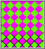
The feeling you get when looking at bright complementary colors next to each other is a vibrating or pulsing effect. It seems that the colors are pulling away from each other. It’s caused by an effect called color fatiguing. When one color strikes a portion of the retina long enough, the optic nerve begins sending confused signals to the brain. This confusion is intensified by the complementaries.
Mixing brilliant complementary colors gets attention, but it should be used with restraint. The effect is disconcerting and can make your eyes feel like they’ve been shaken around.
colorup4_12
If you want to use complementary colors without causing discomfort, you can outline each of the colors with a thin neutral white, gray or black line. The outlines separate the two colors, which helps your brain keep them separated.
When two very similar colors touch in an image, both colors appear to wash out and become indistinct. This is because the borders between the colors are difficult to distinguish and your brain blurs the colors together.
colorup4_13
If you outline each of the colors with a thin neutral white, gray or black line, the colors become easier to distinguish. This is called the stained glass technique and is a way to reduce this blurring of the colors.
Find more out about color at Pantone.com