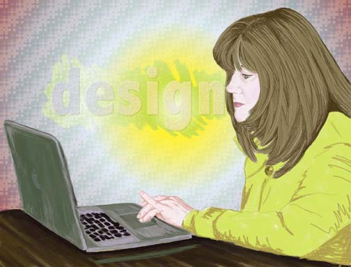
For some people, putting together a DIY small business logo design is easy. Anyone with a computer and software can do it. Can you believe a person built a logo in Microsoft Excel?
It’s often too easy to distinguish a professional logo design from a DIY small business logo design. These tips can save you grace, time, and money.
 1. Color Can Cost You
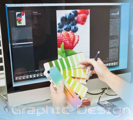
Remember that your digital logo is in RGB. For professional printing purposes, you will need it converted to the CMYK color ink model. For specialty advertising, promotional products, labels, etc., you’ll get a better price if you use spot or pantone (PMS) colors instead of 4-color process printing. Save money and time by making sure you have all formats in place before ordering printing, creating displays, etc. Learn more about the color models in our recent blog post: DIY Graphic Design – Reproducing Your Small Business Logo Design and DIY Design: How to Choose Colors for Your Small Business Logo and Brand.
2. Can You See Me Know?
Your screen is right in front of you and possibly blown up 1000 percent larger than an actual business card. Make sure your logo is legible when it is reduced to fit clearly on a business card. Print at 100% to check legibility.
3. Consider Old Eyes
Depending on who your small business is marketing to, you’ll want to remember that as the population gets older, eyes can’ distinguish certain colors on top of similar colors. Make sure to balance and contrast colors especially when you are placing color on color.
4. Match Your Font Personalities
 Now that you are a designer, it is no longer ‘type.’ Instead, we are sculpting with fonts. My first caution is to please not treat them like they are shoes. ‘The more, the merrier’ doesn’t apply to fonts. We must limit ourselves. Too many styles will appear erratic.
Choose a font that is legible from a distance. This doesn’t mean it has to be simple or boring. A stylish font that communicates clearly establishes a brand.
Which style feels right for your business? A flowing script, or a vintage schoolhouse font for a bridal shop logo? Solid bold sans serif, or edgy and grungy for a manufacturing firm logo? Choose what fits and keep it clean.
5. Logo Size Matters
Your computer screen is 72 dots per inch (DPI). To reproduce a logo that is clean and crisp when printed professionally, your logo needs to be at least 300 dpi. As a guide for business card, brochure or pocket folder printing, your logo file should be 300 dpi by a minimum of 4” tall. Don’t worry about the width as long as it is equal or larger than 4”. For small business exhibit design and other sign designs including vehicle graphics, I say go as big as you can with your logo file – vehicle wraps cover a lot of area, you want your logo to be crisp and clean even at 8” if it is called to.
6. Use Effects with Caution
Be careful with effects that overwhelm your font or graphics. Effects often use shadowing that may distort your business logo when printed or when it is enlarged on a screen that’s bigger than the original. Don’t let your small business logo look as though it’s from a horror film. Unless it is a horror film.
7. No Stealing!
OMGosh get your hands out of the Google images cookie jar! I know everything looks so good in there but you just can’t have it.
Fortunately, there are plenty of clip art resources and stock photos sites available. You probably have some installed with your software. Don’t get crazy and use the same stick person image from Microsoft Office that millions have used in their logos since the 90s’. Be unique, how can you change a stock graphic to make it your own?
There are free resources for stock images online and some with fees that have limits on use. Read use terms carefully. Be careful and respectful, and follow online copyright law.
 8. Eye-Catching Original Graphics
Using graphics in a small business logo design is a great way to help your logo design stand out. If your artist (wife, kid, guy you met at church…) draws a logo graphic for you, the bigger the original, the better. When you scan the logo into your computer, scan it at 100%. If it is a digital illustration the original should be saved at a high resoluton from it’s native application.
An original illustration of a house for a custom home builders logo that is only 1” wide will not reproduce well once it is blown up to fit the side of a vehicle. A small original may also limit how much color can be added. Be sure the style suits the message you want to  portray for your small business.
9. Admit When You Need Help
If you find you are spending every weekend for a month researching and designing and restarting to design a logo for your small business, stop. Think about the value you place on your time as a busy small business owner. Instead, put in a few hours doing what you are skilled at and take the money you made to pay a professional.
10. Honest Feedback
Most important of all, get feedback on your design. Share ideas with your family, friends, people who know nothing about your business and people who know you and that you respect.
Please don’t ask a professional graphic designer for an opinion on your DIY small business logo design unless you are ready to hear the truth. I love it when I can say, it works; good balance and choice of colors, etc. When there are issues… and you already told me your daughter designed it for you… I’m in a bad spot. The designer in me knows it’s my job to create strong brand identities. The human says, I can’t squash a kid or a parent’s dream. Prepare yourself to hear the professional truth, maybe don’t have your daughter in the meeting!
Start your DIY small business logo design
All the best on your business endeavor and enjoy creating your DIY small business logo design and honing brand message!
