If you haven’t heard already you may be one of the few left on the planet who doesn’t live and breathe all that is the internet. What is being referred to as “mobilegeddon” (don’t you love tech-nerds?) or, Google’s mobile website algorithm change launched last week. Small businesses need mobile friendly websites now more than ever. The algorithm change was announced two months back very clearly by Google and they actually went ahead and launched it on the pre-determined deadline, Tuesday, April 21, 2015. What the change means to small businesses who do not have mobile friendly websites is that your company website will either not come up in mobile Google searches or if it does, it will come up so far down it might as well not come up at all.
I can hear some of you now, ‘So, what? Most people search our site from a desktop computer.’ ‘We provide a service, people don’t search for us on their smart phones or tablets, they wait until they get home and research on their computers.’ Not so my friends. “In the final three months of last year, estimated 29 percent of all U.S. search requests – about 18.5 billion – were made on mobile devices.” – comScore.com
The increase in numbers from desktop to mobile searches will continue to grow. The largest percentage of mobile searches currently are done by people shopping for products, however local services searches are not far behind. “Searches with local intent are more likely to lead to store visits and sales within a day. New Google research says that 50 percent of mobile users are most likely to visit (the store) after conducting a local search, while 34 percent of consumers on tablets or computers will go to a store.” – Search Engine Watch
Mobile searches are steadily increasing for local services including, home healthcare services, restaurants, home improvement services and more.small businesses need mobile friendly websites now to come up in those search inquiries.
“According to Google, 56% of searches on smartphones have local intent. ” – Wordstream
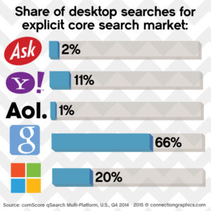
 Google is the top-ranking search engine claiming two thirds of United States web searches and even more in other countries. Mobilegeddon has the potential to effect sales volume especially for small businesses who have not had a strong reason to upgrade to a mobile friendly website yet. If we give an example of a residential home builders website in Lansing who has not upgraded the website since mullets were in style, compared to a national residential home builder with a mobile friendly website targeting Lansing clientele – where would you place your cards on search results?
Not sure if your small business website is mobile friendly or not?
Check out Googles “Mobile-Friendly” test page in its developer section. Type in your website URL (domain name) and see the results. (https://www.google.com/webmasters/tools/mobile-friendly/.
Mobile Friendly Website Solution for Small Business
If you do not have a mobile friendly website and you are ready to make the change, you have a few decisions to make. First you can choose to keep your desktop website as it is and create a completely separate mobile website to satisfy mobile users (and Google!). The drawback to this solution is you now have two websites you must maintain. The other option is a responsive website. Responsive WordPress websites format to fit which ever screen size a visitor is using. On a desktop monitor the website looks good on the screen without unplanned scrolling or clicking. On a tablet it condenses slightly to fit the screen with limited scrolling and on a smart phone the navigation will collapse to a drop down screen. All of this is automated with a responsive website design. The other benefit of a responsive website design with WordPress is small businesses can now update their own website without programming knowledge. Updating is also easier because you only have to update one site instead of a desktop website and a mobile website.
Mobile-Friendly Website Design considerations:
- design web pages so that they load quickly
- make content easily accessible
- page scrolling up and down (as opposed to left to right swiping)
- make call to action buttons (like BUY NOW!) easily seen and touched even on small screens
- make your contact information clickable – click to call, click to map location
- make your text size large enough to read on small devices
No budget for a small business mobile-friendly website right now?
Or do you have a mobile-friendly website on order but all the local website design firms in Michigan or your state are booked solid a few months out? Since Google searches do show local listings first make sure all your local information is current. Get a Google+ page set up if you haven’t already, check your Yelp listing. Get your website listed on Google in Google MyBusiness section. These steps will help while you are working toward upgrading your website to mobile.
If you’re one of those small businesses who need a mobile friendly website right away, give us a call today! We are taking orders and turning custom designs around as quickly as possible. We also provide mobile-friendly Wordpress responsive website design solutions for those of you who want the freedom to access and update your own website .
Stay connected!


