COLOR PSYCHOLOGY
Our personal and cultural associations affect our experience of color. Colors are seen as warm or cool mainly because of long-held (and often universal) associations. Yellow, orange and red are associated with the heat of sun and fire; blue, green and violet with the coolness of leaves, sea and the sky. Warm colors seem closer to the viewer than cool colors, but vivid cool colors can overwhelm light and subtle warm colors. Using warm colors for foreground and cool colors for background enhances the perception of depth.
Although red, yellow and orange are in general considered high-arousal colors and blue, green and most violets are low-arousal hues, the brilliance, darkness and lightness of a color can alter the psychological message. While a light blue-green appears to be tranquil, wet and cool, a brilliant turquoise, often associated with a lush tropical ocean setting, will be more exciting to the eye. The psychological association of a color is often more meaningful than the visual experience.
Colors act upon the body as well as the mind. Red has been shown to stimulate the senses and raise the blood pressure, while blue has the opposite effect and calms the mind.
People will actually gamble more and make riskier bets when seated under a red light as opposed to a blue light. That’s why Las Vegas is the city of red neon.
For most people, one of the first decisions of the day concerns color harmony. What am I going to wear? This question is answered not only by choosing a style and fabric appropriate to the season, but by making the right color choices. And it goes on from there. Whether you’re designing a new kitchen, wrapping a present or creating a bar chart, the colors you choose greatly affect your final results.
How often have you caught your breath at the sight of a flowerbed in full bloom? Most likely the gardener has arranged the flowers according to their color for extra vibrancy. Have you ever seen a movie in which a coordinated color scheme helps the film create a world unto itself? With a little knowledge of good color relationships, you can make colors work better for you in your business graphics and other applications.
Color is light and light is energy. Scientists have found that actual physiological changes take place in human beings when they are exposed to certain colors. Colors can stimulate, excite, depress, tranquilize, increase appetite and create a feeling of warmth or coolness. This is known as chromodynamics.

An executive for a paint company received complaints from workers in a blue office that the office was too cold. When the offices were painted a warm peach, the sweaters came off even though the temperature had not changed.
The illusions discussed below will show you that sometimes combinations of colors can deceive the viewer, sometimes in ways that work to your advantage. They can also cause unfortunate effects in your graphics, so be sure to watch out for these little traps.
Sometimes colors affect each other in unexpected ways. For example, most colors, when placed next to their complements, produce vibrating, electric effects. Other colors, in the right combinations, seem quite different from what you’d expect.
The most striking color illusions are those where identical colors, when surrounded by different backgrounds, appear to be different from each other. In a related effect, different colors can appear to be the same color when surrounded by certain backgrounds.
When you look at a colored object, your brain determines its color in the context of the surrounding colors.

In this picture, the two bows are the same color, but because the surrounding areas are strikingly different in contrast, it seems to our eyes that they are different. Keep this effect in mind when creating graphics where color matching is critical. If you attempt to match your corporation’s official colors, you may find that even if you achieve an exact match, it may look wrong in context.
In the same way that one color can appear different in different surroundings, two similar colors may appear to be identical under some conditions. Even though the two symbols are actually slightly different tones, the contrasting backgrounds cause our brains to think that they are the same color. This effect is harder to control, but be aware of it because it can affect your graphics in hidden ways.
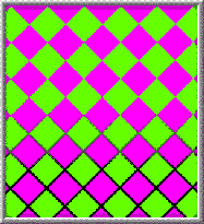
The feeling you get when looking at bright complementary colors next to each other is a vibrating or pulsing effect. It seems that the colors are pulling away from each other. It’s caused by an effect called color fatiguing. When one color strikes a portion of the retina long enough, the optic nerve begins sending confused signals to the brain. This confusion is intensified by the complementaries.
Mixing brilliant complementary colors gets attention, but it should be used with restraint. The effect is disconcerting and can make your eyes feel like they’ve been shaken around.

If you want to use complementary colors without causing discomfort, you can outline each of the colors with a thin neutral white, gray or black line. The outlines separate the two colors, which helps your brain keep them separated.
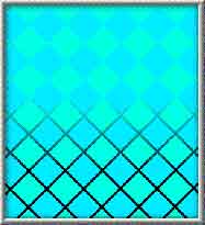
When two very similar colors touch in an image, both colors appear to wash out and become indistinct. This is because the borders between the colors are difficult to distinguish and your brain blurs the colors together.

If you outline each of the colors with a thin neutral white, gray or black line, the colors become easier to distinguish. This is called the stained glass technique and is a way to reduce this blurring of the colors.
Find more out about color at Pantone.com
Connectivity
Receive our complimentary email newsletter with insights on all forms of design, including graphic design articles and web site marketing trends.

