 Choosing the best font or knowing different names of fonts wasn’t high on most business owners mind when I first launched my graphic design career. Most didn’t know what a typeface or font was. With the advent of desktop publishing the world finally understood how dramatically the tone of a magazine or brochure could change based solely on font selection. Today new fonts are introduced daily and small businesses grapple with choosing the best font for DIY brochure designs.
A font by any other name is still a font…
Let’s address that statement that new fonts are created everyday. There are a plethora of fonts out there and a large number of free fonts on the internet. Designing a professional typeface or complete type family is a very technical and precise skill. Take caution when you are choosing fonts for your graphic designs. It’s best to choose a font from a well known font foundry when you can. Some of the free fonts you find online have issues such as not having glyphs or punctuation marks or even numerals. Other concerns may arise with free fonts when turning your promotional materials over to a print professional. If the font you chose is inferior there may be issues. If the chosen font for your DIY brochure design crashes the printers equipment you may encounter most costs and delivery delay. There are also viruses that weasel their way into downloadable free font files – take caution.
 Here a font, there a font, everywhere a font font…
Fonts are to graphic designers as shoes are to women. So many fun, grungy, vintage, classic, groovy, elegant, contemporary, stylistic fonts out there! Fortunately, cloud storage and hard drives are much bigger than standard closets. Font hoarding has yet to become the next reality TV show. I must still caution constraint! Just because you have a few hundred (thousand) fonts at your disposal does not make it okay to use them all in one event flyer or postcard. Step away from the type tool.
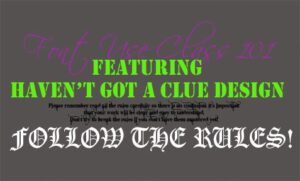
You’ve seen the flyers in local venues. The ones with purple script font headlines with green BOLD heavy san serifs with cowboy ugly fonts for the body copy. And let’s not forget the Old English script in all caps. Every graphic designer dies a little when we see these freaks of nature. Rules people – follow the rules!
10 Commandments for choosing the best font
- Keep with two main fonts for professional promotional print materials
- Choose fonts that either contrast or conform with each other
- BOLD is for emphasis – do not bold your entire brochure
- Is it legible? Frilly fonts with lots of swooshes can be hard to decipher – especially when used in small point sizes such as body copy
- Opposites attract – pair a thin font with a fat font or a clean sans serif with a frilly script
- Matchy – matchy – choose an elegant san serif for your headline and similar in weight serif font for body copy
- For print items body copy is most legible in a serif font
- Online studies show san serif fonts are preferred for quick reads and legibility
- Ornamental fonts (like Old English) were not designed to be used all caps (see #4)
- Match font style to your message. Example: Don’t use comic sans for serious information and don’t use helvetica for a party invitation headline.
Just tell me the best font for DIY Brochure Designs already!
 I already did. I will be more concise – there is no one-size-fits-all best font for every DIY brochure design. It is all so relative, don’t you see? The best font for a DIY brochure design for a restaurant could be a flowing script or a weathered grunge font – what kind of restaurant is it?
Maybe you’re a professional business consultant who advises senior care facilities on end-of-life concerns? The best font for your senior care facility brochure would be a clean, clear font that can be read easily by aging eyes. Are you a home builder or construction company in need of a brochure that speaks to both the man and the woman of the house? Maybe a mix of a script font with a heavier block sans serif font will work? Because of the many variables when it comes to the message, your prospects, and the product or service you are offering there is no true best font for your DIY brochure.
The best approach to choosing a font and designing your company brochure is be sure it is legible. Be clear, legible, and sane – no dysfunctional color and schizophrenic font use! You don’t want your prospects running away screaming amateur, amateur! Keep the information you want to share and the people you want to share it with in mind as you design your company brochure. Remember what your company brand message. Marry the fonts and visuals with the brand message and you’ll make a connection with your target audience.

